HOW TO USE A COLOUR WHEEL
I was talking to a customer the other day about the successful application of colour in a room and she was really interested, which got me thinking about sharing some tips here on my blog. The successful design of a room is so much more than painting the walls in a colour; understanding monochromatic and complimenting colour schemes also really helps you understand the look you're after and then how to furnish it.
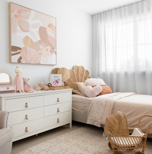
A monochromatic colour palette uses varying strengths of a single colour, these schemes are always relaxing and serene. Using light and dark tones of the same colour adds interest, and produces a touch of energy in a room. Using all dark tones in the same colour makes a room moody and dramatic, but most often we use light tones in the same colour family which creates a relaxed delicate feeling. Look at the bedroom below, all of the colours are from the same family, so it's a monochromatic colour scheme. The painting above the dresser is an example of using light and dark colours which adds energy and interest.
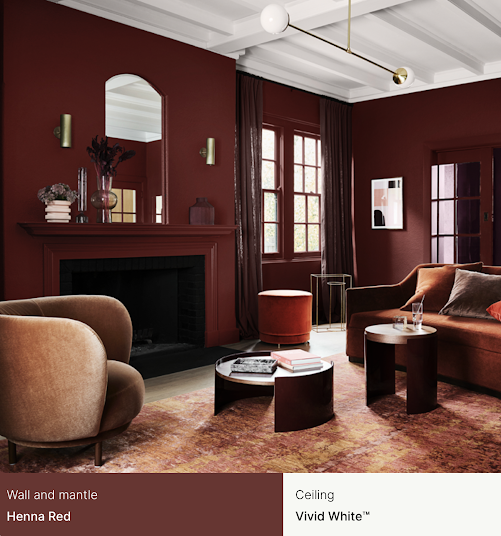
This room is a typical example of a monochromatic colour scheme using dark tones all in the same family, including furnishings. It sends off a moody and dramatic vibe.
Complimentary colour schemes use colours that are
found on opposite sides of the colour wheel. Blue and orange, red and green, purple and yellow. When using complimentary colours its imperative that you use similar base tones, like in the example of the painting below. You don't have one really bright colour, but they all work harmoniously together.
My favourite way to use a colour wheel is using a contrasting palette. These colours are not exactly in the same colour family or they aren't exactly harmonious, but they do work very well together. Use a bold, deep colour and contrast it with a light tone from a different colour family. In this image, the neutral grey (moody) backdrop acts perfectly for the timber accents in furniture, then note the pops of colours, like bright in the pot plant, the touch of red again in the cushion to balance it. The blue squares in cushions blend perfectly well with the colour of the books.
It's best to have a neutral back drop, decide if you want a monochrome room, or a contrasting room, then go for it! Have fun and add your personality along the way.


Comments
Post a Comment